OUR WORK
newstel worldwide
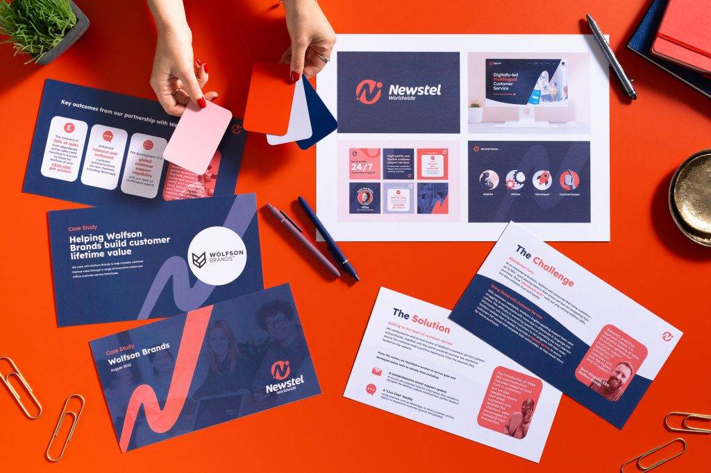
Newstel Worldwide is a high quality contact centre based in hamburg, germany. founded in 2015, their global team offers businesses complete multilingual customer support on demand.
“At Newstel, we’re on an exciting journey of growth but when we looked at our branding identity we felt it didn’t represent who we are as a business. The team at Parry Creative have been brilliant at helping us express how we feel about the business, turning these thoughts and feelings into our new branding, an identity that truly shows our uniqueness as a Customer Service Outsourcing business that supports ecommerce businesses on their own journey. We are very excited to be working with Parry Creative on the next phase of our branding, rolling this out across the business and feel confident that they will continue to bring new design ideas and clarity to our branding.”
Kerry White
Operations Director, Newstel Worldwide
The brand
Newstel Worldwide is a high quality contact centre based in Hamburg, Germany. Founded in 2015, their global team offers businesses complete multilingual customer support on demand.
The brief
The CEO, founders and key stakeholders are forward-thinking, positive and energetic. They came to Parry Creative with ambitions to ‘change perceptions of the customer service industry’ through a rebrand that would both capture their persona and shake things up within the market place.
Before putting pen to paper, we worked with the key stakeholders to gain an understanding of the values, personality and visions for the future – from this session we had derived a clear brief that we needed to create a brand identity that would not only appeal to their customer base and reduce a stigma in the industry, but more importantly help drive the internal culture of their employees, maximising employee retention and attracting new team members, allowing the business to scale in the coming year.
The concept
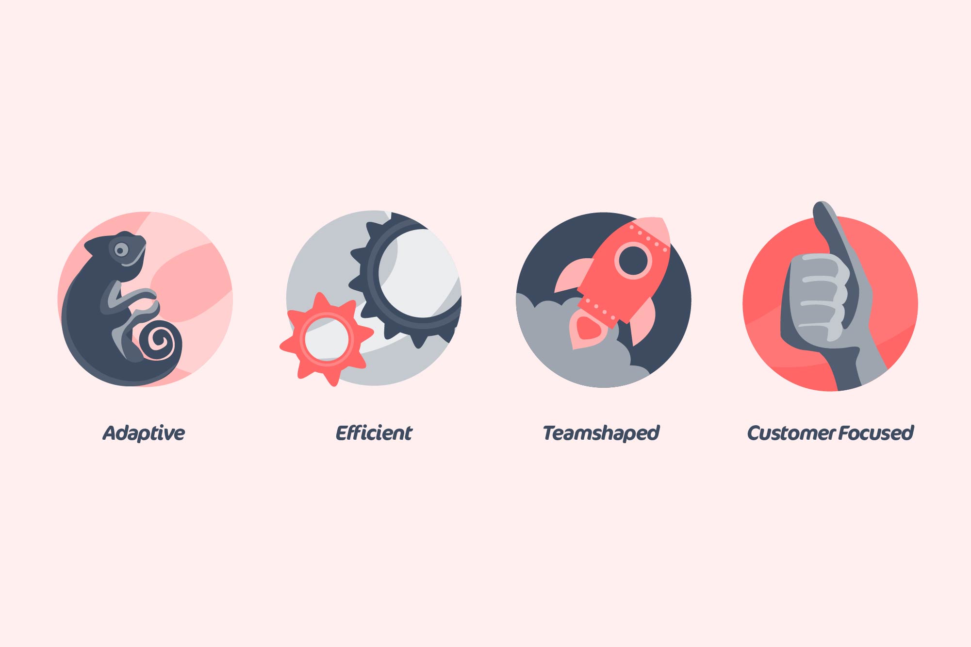
Our icon logo represents the world, with an abstract ’N’ cutting through the centre. On each end point there is a dot that starts off small on the bottom left, leading to a larger dot on the top right – this symbolises the growth and development journey they have been on through working with/for Newstel Worldwide.
Moving through onto the colour palette – our key colours are a deep grey blue with a vibrant coral. The blue acts as a grounder – representing stability, technology and knowledge. Whilst the coral provides the energy, flair and positivity of the company persona.
We have paired this with the typeface Cocon – in Bold Italic font. This curvaceous typeface really plays well with the aesthetic of the organic swoosh within the icon. The italic nature of the font also helps to emphasis that feel of movement and journey seen in the icon logo.
ongoing support
We have now been working with Newstel Worldwide over the last 6 months to develop this identity, rolling it out into the wider marketing materials including the website, presentations, motion graphics, social media and branded collateral.