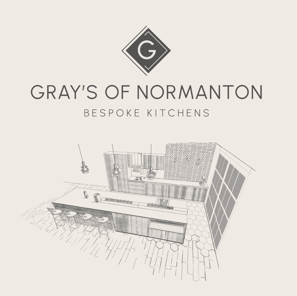
We’ve really enjoyed working on the brand creation and website for Gray’s of Normanton – an independent kitchen design boutique based in rural Nottinghamshire.
With decades of industry experience, Gray’s of Normanton offer the very best in bespoke kitchen and interior renovations.
Naturally the brand identity needed to have a high-end, exclusive quality – to reflect the calibre and level of their service and products.
We first started with the logo design, using a clean san serif font, with extended kerning to create a minimal look that also carries gravitas. Teamed with a signature G icon, that sits within a diamond shape – a nods towards kitchen plan drawings, layouts and architectural plans.
Once the logo one in place we then built a clean one page website – elegant and sleek! This scale of website and style of design works perfectly as a simple introduction to services and acts an easy contact point for customers.